Saturday, February 21, 2009

Why Young Mothers Feel Trapped

I have had such a fun, productive week creating art. This piece is one I have been cogitating on for a while-- waiting for the right time and place. It finally came together this week. I created the back ground by doing an underpainting in midnight blue (a mix of phthalo blue and black) on a piece of canvas cloth that I had coated with gesso.

Then I did a layer of small block prints in white and gray on the blue, and went back over it, hand painting in white, grays and red, highlighting or exaggerating shapes I liked.

I wanted to leave branches showing against the sky, so I used negative painting in a warm blue mixed with titanium white and painted the sky around the branches, freehand.

I had found this great article in a Reader's Digest from around 1960 called Why Young Mothers Feel Trapped. I cut out a portion of the picture and the title in the shape of two little birds. I used some more of the very old catalog pages (see previous posts) from an ad which had in bold Boys and Girls and used it to make a nest. Here is the result. It is in the stage where I am watching and waiting to see whether it is done.


Here is a piece I finished today. It is also mixed media using acrylic paint and collage. I started with torn pieces of a reproduction of one of my acrylic paintings called Lights of Home. I cut small bird shapes from vintage papers and printed on the canvas and the birds with my hand-carved, small, shaped printmaking blocks.

Its title is not all I would wish, but will do for now-- Two Little Birds.


There's lots more to show and tell, but I will save it for later!

Monday, February 16, 2009

If A Red Hand


Not too long ago one of my artist friends shared some very old pages of a Sears and Roebuck catalog with me. Having used some pages from a magazine from the early 1960's in a recent work, I figured I would find a way to use these as well. It would need to be soon, however, because the pages were so fragile, just touching them made them break apart. I took several sheets, including some advertisements and what looked to be newspaper articles and stories, and as you can see above, some ads for ladies and children's clothing and undergarments from the turn of the last century. The only date I could see on any of the pages was 1899.

I spent today working with the pages, beginning with a page of ads and articles, one of which began in larger type than the words around it, "If a red hand..." That was just too intriguing! So I took a sheet of printmaking material, 9 x 12 soft block that my husband had given me for Valentine's Day (he knows the way to MY heart!) and traced my hand and wrist on a piece approximately 6 x 9. See the delicate thing below!


I also used some Butterick dress pattern paper along with the very old catalog paper to create the first layer of my piece, using matte medium to coat the back and front of each piece. Birds had to come into the design somewhere, so you see them perching on my thumb and pinkie, and I made a larger bird block which I also printed in red on the collaged papers. Here is what I have done so far. I will let it be for a while and listen to it tell me what's next!


In case you are wondering, "if a red hand" appears on the first page of your newspaper, it is time to renew your subscription!

Sunday, February 15, 2009

Blog at work: Making Gel Transfers


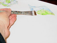
I had an piece of map that I wanted to use in collage. One way to make a sturdier element is to turn a paper piece into a gel transfer. This is done by coating the item over and over (usually at least 3 times) with acrylic matte medium and then allowing it to dry for 24 hours. Soak the item in water and rub the paper off the back. It creates a plasticized collage piece that has some transparency.

Friday, February 13, 2009

For You Are Crunchy and Taste Good with Ketchup

My son entered a piece of artwork in the current show at LibertyTown called Young Fredericksburg Here is the piece, which sold this week!


For You Are Crunchy and Taste Good with Ketchup, Matt Seaver


He also created some ephemeral art today and cleaned the hand building table at the same time. Here is Matt's rendition of Our Founder, Dan Finnegan.


And other personages:


And lest you think he is the only one in the family being artistic. I am creeping up on starting something on these cool pieces of plywood from a packing crate that Rob gave me.


I took the narrower board, sanded the rough parts, filled the holes and blemishes with acrylic caulk, and toned the wood in a midnight blue. Now it is a painting in waiting...

Wednesday, February 4, 2009

Pins and Pendants


I got an order for painted slate pins to go with a group of women from our church on a retreat this weekend. I also made a couple of pendants. Above are the pins laid out on my work table. A friend is picking them up tomorrow. We'll see how they sell...

Below, see new pendants. The picture of the first one is not good--the light was terrible. The square bead is a red ceramic and the matching ones are yellow frosted glass beads.

I love slate shaped like above. It makes a fun faux bead piece.

Monday, February 2, 2009

Change of Scenery

A Change of Scenery is a painting that I really enjoyed working on in September of last year. I started with muslin which I covered with three coats of gesso. Then, able to work flat on my table, I used my hand carved soft blocks, and printed all over to create the fall leaves. I have used this same photo for at least two other paintings because it is so beautiful with its mixture of oranges, reds, golds and greens. The photo has a white birch in the foreground, and I had painted that birch in the other pieces. But, this one, I liked as it was with only the dark tree.

The more I lived with it, though, the less I liked the starkness of the cool yellow I had used so genrously. I wanted to warm the painting up. Finally, during repaint and refurbish season (going on now!), I have gotten it back off of the wall to play with. By now, of course, I have stretched it, so using my blocks on it is not as easy. For the changes, I used brushes instead.

I began to add warm reds and oranges and golds painting over or around the prints and shapes I had made earlier. Then I began to paint in a warm blue mixed with titanium white to create the open places you see through trees to the sky. I paint instinctively when I get going --it's really an exploration. I already don't like what is there, so it frees me to do whatever I think might make it a better painting.

I think I am done with it now--at least for this refurbishment season!


Change of Scenery, acrylic and printmaking, 28 x 29

Sunday, February 1, 2009

More Birdies

I think I'm ready for spring migration, or something. Birds keep popping up in my paintings. Here's another one!

Today's high temperature--64! Pure bliss for this Texas girl, who lived for years in a major flyway (for the birds, that is...)